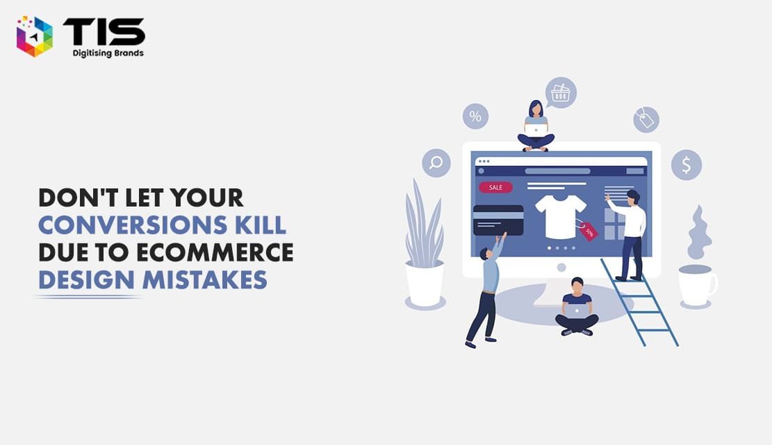
With the fast forwarding pace of the web design industry, the need of having a visually appealing website has become an indispensable necessity especially if you own an eCommerce store. As technology is evolving with every passing day, the growth of eCommerce has skyrocketed with thousands of online stores competing with each other. Being the owner of an online retail store, you must be tracking new ways to keep your business’s growth on high levels; however, the most important factor that contributes significantly to drawing major traffic to an eCommerce site is its design. If your site does not exhibit professionalism in its design, it might not be able to attract the attention of online buyers.
So, here the main point of focus is to explore the tips that can help in creating a visually appealing and professional-looking eCommerce site because a perfectly designed online store is a guarantee of higher sales.
However, it takes time to learn and execute the correct tips with proper planning to offer a great shopping experience to your buyers. Among the bundle of tips I have researched the top 8 tips that every online retailer should implement on their eCommerce site for enhancing the conversions and sales through it are:-
Table of Contents
The value proposition is the first thing that helps online retailers to decide if people are interested in reading about their product or not. Hence, while designing an eCommerce store, it becomes necessary to incorporate a strong value proposition as it will serve as the argument as to why your target audiences should purchase from your store when they have options from your rivals as well.
Most online stores lack the knowledge of having a clear value proposition on their sites, which creates confusion among their customers to interpret what they are exactly selling to them.
You can see the landing page of petsworld.in which has made perfect use of attractive pictures in their value propositions.
What elements are necessary for creating a clear value proposition?
Online stores are the places where the customers can’t touch and feel their products, but they can only read the information and check out the images of the product to take their final decision of purchase.
If you are not using high-quality images with multiple angles on your product page, you might lose the chance of a successful conversion because images are something that plays a very crucial role in making your eCommerce site attractive and it also helps in increasing the sales by motivating the customers.
You can see in the example given below how an online shop has used the multiple angle technique for representing the product from different angles. It will not only help its visitors in checking the look of the product from different angles but will also incorporate a sense of confidence in them that if they purchase this product, they already know how it will look from all angles.
You can also use a 360-degree video of your product that gives the perfect view of your product to your site’s visitors.
The checkout page is undoubtedly one of the most important aspects of an online store that if created excellently ensures decreased shopping cart abandonment rates. You will be surprised to know that 7 out of every 10 online buyers put some products in their shopping cart but leave the site without making the purchase. Why is it so? This is because your online store lacks a trustworthy checkout page, which is essential for generating confidence among your customers that their confidential and financial transactions will be processed securely.
Use an SSL certificate for your payment page that guarantees customers that their information will be used securely.
Another way to make your checkout pages trustworthy for your customers is to show the trust symbols clearly on your checkout page with a security badge like McAfee, Norton, Verisign, TrustPay, etc.
Often people add too many products to their shopping cart and things end up with lots of confusion. The best way to avoid this is to show all the order information clearly to your visitors. The list of information that should be displayed on the checkout page of your online store includes:
You can show that the customer gets an overall view of his or her order in the form of an order summary. It also shows the image of the product along with the number of units ordered, price, delivery details, and the subtotal.
It is no more a secret that mobile commerce has seen a significant splash of growth in recent years and hence, when you are planning to design your eCommerce store, don’t forget to make it mobile-friendly or responsive. If you will not make your store mobile responsive, you will lose a great section of your overall site’s visitors including all your mobile target audience. Therefore, pay attention to responsive design when it comes to creating an online store. A professional eCommerce site should look professional only when it is adjustable to the varied screen sizes of mobile devices. Select the color, background image, and font, for your online store by taking care of both your desktop and mobile users.
A seamless mobile experience like the one shown above is the best way of making profit through online stores. If your eCommerce site has all responsiveness integrated into its design, it is definitely going to enhance the conversions on your site.
To conclude, the above-mentioned are some of the most common mistakes that people make every day while designing their eCommerce website or store. If you are able to avoid these small errors, you might have a great chance of designing the most successful website for yourself.
Overall, none of the above-mentioned tips is very difficult to implement on your eCommerce site. If they are executed effectively, it will not only generate sales but will also add the perfect touch of professional input to your online store.
To give your customers the best experience, you can yourself spend some time and try out different eCommerce stores and observe and assess what you like and don’t like about them. This will help you create a picture of the customer journey and you will be able to understand better what works best and what does not.
Do you have more suggestions for building a visually attractive and professional eCommerce store? If so, don’t hesitate to share your thoughts with us in the comment section.
7 Reasons Why Internet Marketing Is Important For Your Business
Top Advantages of Using WordPress for Developing Business Website


 672
672 


 (+91) 9811747579