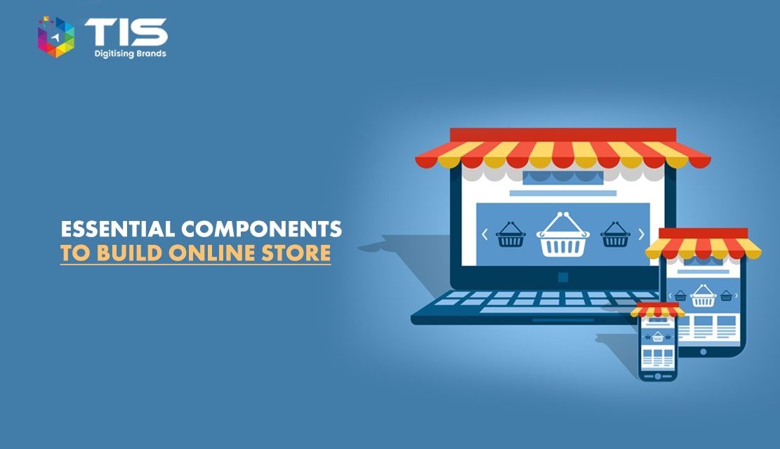
The way shopping used to be done has changed a lot with time and technological advancements. Today, customers prefer their shopping done on the internet on innumerable eCommerce websites. There is a constant war among these sites to engage as many customers as possible. Today, online shopping is no longer a niche market as it reaches out to a large number of customers all around the world, people visit websites every day in order to find the best offers online. We all are aware of the success and efficiency of this system and how it has changed the way shopping is done. Since this platform is expanding and evolving at a fast pace, it is important to have certain components that are essential for the success of an eCommerce site. Some of them are-
Table of Contents
Not only for start-up shops but also for well-established and known branded stores, a well-designed and eye-catching logo is very important. A logo that can be easily identified and kept in mind is necessary when it comes to online shopping. A logo is a symbol of trust in an organization or a company. Many popular branded stores have an interesting site with minimum features, but a fashionable page altogether. This helps in gaining the attention of the target audience. A well-known mascot attracts the attention of the customers without fail. The fun colors that are used in eBay’s logo- red, blue, yellow, and green describe the theme of the website – friendly, open, and accessible. The logo simply reflects that eBay is a fun place to buy and sell stuff.
People work very hard to make their site interesting and attractive and they work on every page, but it is a well-known fact that visitors decide whether or not they like a website in just a few seconds. It is an instant like or dislikes, thus it is very important that the home page of a site is made quite interesting. It must have all the necessary elements that help to grab the immediate attention of the visitors. The site must be easy to navigate and page loading time must not be more than necessary. Another factor that grabs eyeballs is shopping deals. People love to do something about their shopping itch and if attractive deals and discounts are available, they are ready to buy anything under the sun as it is available at slashed prices. For example, Pets World, the Pet Food Shop in India offers amazing discounts at Wag Shop where pet owners can buy pet products and accessories at crazy low prices. Discount offers and eye-catching ads and banners on the Home Page effectively attract a large number of visitors.
eCommerce websites also offer free shipping services as now the companies are not restricted just to the local market, but have transcended geographical barriers and catering to the entire world. Thus, the costs of shipping are also taken into consideration, still, it is affordable when compared with actual stores. It is seen that when shopping at branded online stores or big retailers, multiple purchases results and that makes shipping services added to the shopping value quite negligible. Also, customers are not deterred by free shipping even if the order price is low. Moreover, shopping online sans any deal or discount is still reasonable as compared with shopping at boutiques or shops. If we talk about shipping strategy, the best example is Zappos. The e-commerce company, Zappos offers free shipping services to their customers no matter what the amount is. If you are not happy with the product then a return facility is also provided by the company.
Every customer has unique choices and demands, but it is practically not possible to give space to each product on the home page. Thus, most eCommerce sites place their most exciting and eye-catching offers and products on the main page, ensuring ready accessibility. The retailers who have a huge collection of products make things easier. Branded merchandise is given a premium position followed by other less known brands. Also, the items on sale are placed up front, followed by the newly added branded stock. The idea is to grab the attention of the target customers, especially first-time visitors who take some time to get a feel of the site. Using effective and targeted channels, customers can look for the merchandise they were looking for! Amazon is an amazing example of this strategy. The website has a filter that keeps the most popular brands on the top followed by the least recommended. They even have a different section for other brands that are majorly highlighted on the index page.
The features of an eCommerce site like the Login Box, Search Box, and Shopping Cart must be placed close to each other. Having an eCommerce site without a shopping cart feature is unthinkable. A simple-looking cart can be made to denote a shopping cart in a prominent corner space. Private accounts are created and shared with customers by several stores where they can review their past and present orders. The customers are given Login and password details that help the customers to further access the site. Such premium customers also get to enjoy special schemes, discounts, and offers. Having a Search Box feature on a site makes it easier for the customers to wade through an extensive collection by streamlining their search. The website of Marks and Spencer has everything aligned properly. Log in, Log out, Cart, and search tabs are placed quite close to each other which gives an excellent opportunity for customers to explore better.
The eCommerce sites have been able to reach out to customers located in different parts of the world and it is important that the payment options given to the customers meet their desire. In case there are any technical limitations to any payment system, the same must be clearly stated. For example, many sites do not accept International Credit cards and some sites make it mandatory to share the billing and delivery address of the customer in the country where the store is located. This limits the number of customers. Thus, whatever payment options are available with the site, they must be clearly displayed in plain sight on the Home Page, reducing confusion. Snapdeal.com has the best solution to deal with this problem. If you see the index page footer, there are icons that tell about payment options. All these icons help customers to understand payment options in a better manner.
If you are new in the e-commerce industry and don’t have enough resources then it will be better to hire an e-commerce development company to assist you. Incorporating the above components help in creating a successful eCommerce site
7 Reasons Why Internet Marketing Is Important For Your Business
Top Advantages of Using WordPress for Developing Business Website


 761
761 


 (+91) 9811747579