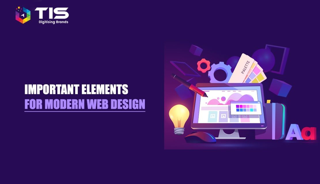
Website Design is a continuously evolving industry. New elements and styles are continuously making their way within a blink of an eye.
However, your business could achieve big targets if these elements are incorporated thoughtfully and strategically. If done correctly, you could successfully tell stories to your audiences.
If you have not yet allocated a part of your budget toward web design- It is high time that you do it. Time is high that you play your cards right, and analyze if your layout is all perfect. Could further changes be done? Is the call to action as per expectation? Do you need a responsive website?
Table of Contents
Web design is an evolving art. There is an evident difference in the way web pages used to appear once, and how they appear now. They are far more streamlined and user-friendly than before. Online marketing also is a far more lucrative option than outbound marketing, as Content marketing costs 62% less than outbound.
Websites, over the span of the last 15 years have grown out to be more than just a digital presence. Its affiliation to business and the potential it has to increase your brand’s sales is simply incredible. There is a direct correlation between website feedback and design. A certain study found that 94% of negative website feedback was design related.
And as we all are well aware of the fact that wherever there is a business involved, there is competition. To get leverage over the competition, designers are now trying to understand the most basic aspects of web designing – “what is it that the users are looking for?”
Getting visitors to your website is similar to getting people to visit a restaurant or a luxury villa; the neater the place, the more visitors. A neat and optimized website encourages trust. Studies show that 84% of the searchers online will not make a purchase if they are dealing with an unsecured website.
As the digital era progresses into 2023, there are key elements of modern web design that need to be borne in mind, to ace the web designing game. Below, you will find a list of those elements, explained in detail to make you realize each crucial aspect of making a successful website.
How to Approach
Minimalism may look far too simple but is the hardest to achieve. It is a simplistic layout minus the clutter. Some of the finest examples of exceptionally neat websites are Studiorotate.com and MikiyaKobayashi.com.
The central idea of minimalism is to focus on just one thing about your website that you want your visitor to leave with and make it the most memorable thing about your website’s landing page.
Hire the industry’s best web designers to make your website interactive that has a better user experience, and lesser bounce rates, stands out to give you an edge over competitors & has that wow factor that can compel your visitors to convert.
Benefits of Adopting Minimal Design
People usually do not enjoy reading online that much. They need more visual aesthetics and fewer things to remember (simply because they already have so much too). When you focus your website on informative pictures and videos over text, plain typography, and remarkable use of white space (in the examples you saw above) you end up garnering their attention longer, and it also helps in total recall value.
Minimalism shifts the focus on a visual representation of what your brand has to offer, which is the crux of website designing.
This is an era of infinite scrolling- discover more as you scroll. But the real control lies in your hands. Control the speed of the scroll, and the animation that unfolds. Keep a nice balance – it should not appear boring to the user and nor should the mystery unfold itself too soon that the suspense is lost.
How to Approach
Typography is all set to hit its all- high in the forthcoming years. With the likes of Google fonts, Typekit, and others taking the internet by storm, typography has become increasingly popular. The new fonts which are simpler, clear, and crisp are sure to replace the age-old fonts like Arial, Georgia, Verdana, etc. A peculiar font that is unique to you will go a long way in reminding people of your brand. If you look at the Coca-Cola font, you can instantly make it out. The font has a large part to play in your website. Therefore, making it small would just make it unrecognizable.
For people to recognize and remember the font on your site, make sure you showcase it on your landing page itself. If you see Sergey Makhno Architects (mahno.com.ua/en), you will see a geometric font representing their architectural expertise spilling into their website design.
Benefits of Unique and Large Typography
Unique and large typography adds to the overall aesthetics of the website. Studies show that 38% of users will stop visiting your website if the layout is unattractive. And if the font does not match with the design of your website, your layout goes for a massive toss, which would reflect on your business sooner rather than later.
Most of the time, you don’t even realize that you micro-interacted with an interface or design. Did you notice that you woke up turning the alarm off? Well, this is a sort of micro-interaction. And you liked that selfie over Facebook. This again is micro–interaction and it manifests itself greatly in devices and apps that are in use.
Don’t go overboard with these micro-interactions. You have to keep them invisible. Make sure that the interaction is more human and less robotic such that people are indulged in it without notice.
Micro-Interactions are an important part of any digital design project. There hardly would be any app or website that doesn’t involve the interaction of humans – be it a status update or quick result of an action.
Overall makes your design more intuitive, and adaptable and enhances its usability. You get a step closer to the process of developing a human-centered design, and this is what pleases the users- crafting human-like moments vividly.
How to Approach
Custom graphics have emerged as a new trend, and there is a specific way you have to go about it. The custom graphics you choose for your website has to be immensely unique. If you look at ToskaChocolates.com – a chocolate website from India, you will see chocolate being peeled off its wrapper as you scroll down.
This arouses the tasting sense of the user scrolling down the site, making the user want to buy the chocolate.
Benefits of Character Design
Studies show that 75% of consumers make judgments about a company’s credibility based on the website design. Back in the 90s, when Sprite’s curly-haired mascot – Fido Dido – donned the television screens, it took the brand’s marketing charts off the roof. That is the power character design holds when it comes to endorsing your brand over virtual media.
The design is all about telling stories. And you become a better storyteller if animations are employed. It makes the overall experience a lot more entertaining and interactive. As beautiful as the experience, it makes, sticking the animation anywhere senselessly can destroy the user experience to the same level.
– Loading animations
Nothing is more boring than a loading page with white background. Loading animations tend to entertain the users and keep them hooked in such cases. Loading animations could add stars to a simple flat and minimalistic design. But, keep them simple and choose the ones that match the personality of your website. They should be in the same color coordination as your theme.
– Hover animation
Hover animation is known for providing instant visual feedback. The user hovers the mouse over the content and the hover animations just surprise the user by bringing before him the hidden details amazingly.
– Non-scrolling menus and navigation
They help you save screen space and add to the overall aesthetic look of the website. They only come out when a specific button triggering their action is clicked.
– Motion animation
Well, this might serve as your ace if played properly. If yours is an eCommerce website, just catch more eyes with motion animation. You can make use of this effective technique while displaying your product from various angles- upside and downside left and right. Motion undoubtedly catches the user’s attention more than anything. This helps you gain the interest of your users- and this is what you want right?
How to Approach
Undoubtedly responsive design was sure to make it to the list. Smartphones are remarkably accessible. That is one of the prime reasons why 60% of consumers click on mobile ads at least weekly. The engagement and the traffic received by users on a mobile phone are far more than on any other device. 80% of Smartphone users use their mobile device to access the net, and that shows how really important a mobile-friendly design is.
Making the website responsive to various dimensions of mobile devices is crucial. The Hamburger layout for the menu tab is a good pointer to making the website more mobile-friendly. The Indian Clothes and merchandise brand TheSouledStore.com is a good example of a responsive website, which shrinks or expands as per the dimension of the screen of the device you access the site.
Opt for the best Responsive Website Design services in this multi-device world where 83% of mobile users say that a seamless experience across all devices is very important.
Benefits of a Mobile-Friendly Design
When there is a website that loads without any hassles on your user’s mobile device, you will notice that the user can spend more time on the site. And the obvious outcome of this would be a higher sales ratio.
Statistics suggest that in the last quarter of 2017, close to 52% of all global web traffic originated from mobile devices. Hence, if there is a way your user can spend more time on your website, you should make the necessary provisions to make that happen.
The design industry has evolved like anything. More and more online businesses are now focusing on the concept which makes use of the mix of both design and content. The content that could be converted to a range of formats is on the rise. Websites like Slideshare and Piktographics give you the freedom to convert your content into the form of a presentation slide or infographic likewise. Not only this, there are various other formats as well the content creators for you to choose from. Storytelling has become an art now, and this is only going to experience a steep rise.
How to Approach
Hero images are huge banner images that are placed with the intention of grabbing the potential customer’s attention. They are supposed to be eye-catching and visible. If you happen to hide it behind text or a shabby clutter of menu options, then the hero image would lose its charm.
Measponte.it is a prime example of how hero images should be placed on the website. The text should blend with the banner image in a seemingly seamless manner.
Benefits of Responsive and Large Hero Images
Large and responsive hero images set the expectation right for the customer. They would not be expecting anything other than the products or the services you offer. Like Onirim.com does on its page, every image that flashes elicits a sense of vogue and panache. Having creative images flashing on your page would interest the user and make them keep coming for more.
One thing that has experienced the most revolutionary growth is the landing page design. And the most recent trend is the addition of live product previews on landing pages. The video showcases the virtual tour of the whole product. This was secretly adopted by Slack, wherein the vector graphics covering the slack interface was illustrated beautifully.
How to Approach
An important element in website designing is composition. It helps structure your website’s layout. Even the best font and hero images and UI/UX would fail if your website’s overall composition remains to be a mess. The basic idea as per the Rule of Thirds or the Divine rule of Photography is basically aligning the pictures or texts on the site on the four focal points of six intersecting lines. It could be aligned on the two left focal points or two rights.
Benefits of the Rule of Thirds
On applying the rule of thirds, the page looks a whole lot organized and appealing. The font and the pictures do justice to what it is deemed to accomplish. If you see the MarcusSchramm.net website, you will see the rule of thirds being applied incredibly, making the landing page look harmonious and a safe site to be at.
UX remains an undisputed center of attraction for all. 5 years back, UX was barely popular. But now with the advent of free UX eBooks and UX stack exchange, you could easily make the combination of interface design and UX work like anything, with the end result being a fantastic user experience.
How to Approach
For those of you unaware of what white space is it basically is the negative area in any composition. An unmarked distance between two objects ends up giving the viewer a sort of visual break, by minimizing distractions and making it easier to focus on the subject at hand.
Benefits of the White Space
If you check out the website Welikesmall.com, you will notice white space used in a video format, where their homepage displays a demo reel of their recent video projects. This manages to attract the attention of the viewer.
They have added the call-to-action button at the center, with nothing much around it, giving it all the space on the page to be visible to the viewer. Undoubtedly, this would make the viewer click on the button and check out more things on the site.
White space enhances usability, and that is found to be one of the most sought-after characteristics of a website as per a survey conducted in the United States. 60% of the respondents have agreed that they prefer usability. Pair usability with aesthetics and what you have is a fabulous website.
They were first made popular by Pinterest and since then, there was no looking back on them. The card layout could easily be mimicked using JQuery and Masonry. The card layout serves the website that has a lot of data. Card layouts are a huge hit among online websites, and websites like The Next Web and UGSMAG are already showcasing it.
How to Approach
A short video regarding the product you offer or services you provide livens the page up. The Website Watson.la is an impeccable example of this. They use white space and short videos, with hero images and amazingly contrasting colors in such a wonderful manner, that you cannot move away from the charms of the site.
Benefits of the Feature videos
A feature video enhances the user’s experience. As we already are aware that video content is currently the most sought-after form of content. Cashing in on this potential is undoubtedly a good option.
A video is the most attractive form of content and since it is just 2.6 seconds for a user’s eyes to land on the area that most influences their first impression, grabbing their attention hook, line, and sinker through a video are a sure-fire method.
You’ve got some unique features in your product. Why not highlight those and catch eyes? This is the simple logic that various B2B websites are now displaying large product images on their websites. These images are not only responsive but easily scannable as well. This instantly catches the visitor’s attention helping him fetch a solid understanding of the product through images.
How to Approach
Full-width video background works heavenly for small and big businesses alike on the web. This serves as a perfect way to showcase your organization’s motives simply through the home page of your website. The idea could be perfectly realized by start-ups too.
Background videos are innovative alternations to hero images or banner images. If your brand deals with videos, then this would be the best approach to follow. It basically is a stream of videos playing in the background of your site header, making the page come alive.
Startups can choose to display their testimonials and portfolios via full-width video in the background with some parallax scrolling and bold typography – keep the eyes rolling! However, be cautious. This might be distracting for the user if not done correctly. The key is to create a gentle movement of images without too much haphazard.
Techyscouts.com is a prime example of a background video constantly in motion. This breaks the monotony of a static landing page, making the website all the more memorable.
Benefits of Background Videos
A background video adds attractiveness to a rather motionless website. It sometimes just takes 17 ms to form an opinion about a website. In order to make this super-fast formed opinion tilt in the direction of your site for longer; using an interesting background video would benefit your site.
How to Approach
Being very distinct about what you are selling is the key to an effective website. Genesis.com understands this, as you can see a giant product image making up most of the landing page. Also, if you minutely observe, it also applies the Rule of Thirds and Negative spacing has been effectively used to contrast the color of the car.
Benefits of Giant Product Images
When a product is displayed through a giant image, the highlights of the product are highlighted. This reinforces the benefits that come with the product. The end user understands exactly what is happening on the page, and the product receives the total and undivided attention of the user – which, by the way, is the ultimate goal of a neat website design.
How to Approach It
The call to action is pivotal in encouraging engagement. For you to get maximum interaction from the user, you have to focus on the button. Do not hide the button within too much design. The entire motive of minimalization and using adequate white space is to enhance the appearance of the call-to-action button.
The call-to-action button is everything your website design works toward. If the design of the website has impressed the user enough, they will click on the button to venture deeper into your site. That is your one shot at generating leads. Make sure you do not miss out on this.
Benefits of a Distinct Call-to-Action Button
One of the most innovative call-to-action buttons is the one shown by Ultranoir.com, wherein the image is water-like, and reacts to the pointer. It tempts you to take action, just to see where it leads you. The page it eventually leads you to, is amazingly contrasted and innovative designed.
How to Approach It
Everything online will pay off only if you make it visible to the search engines. If the search engines are unable to find your site, all your aesthetic efforts value to nothing profitable. Basically, SEO is a set of rules to follow while designing a site.
The most important motive of SEO is to make the site a comfortable experience for the end user. The guidelines for SEO are centered on user-friendliness. The aspects of effective SEO include adding Meta tags, title tags, heading tags, etc.
Consider hiring a team of expert SEO consultants who carve out to provide an awesome SEO service experience with a blend of social signals & content marketing efforts.
Benefits of SEO
SEO helps bring your site to the light of the day. If you have managed to crack it down to the core, then you would see that whenever the user types the keywords you have used, your site would pop up immediately. With an aesthetic site that has everything pleasing to offer, right from font artistry to visual aesthetics and on-point content, you can rest assured that the user will keep coming back to your site.
How to Approach It
Colors have a lot to do when it comes to adding to the aesthetics of a website. After all, it is what enhances the visual appearance of the site. You have to wrack your brains to understand the nuances of colors and predict the interplay between them to suit your site.
Adding too many colors would make your site seem shoddy, and the user, most likely, may not return. Using just a few, but thoroughly planned out colors, would enhance customer experience, making them want to keep coming for more.
Benefits of Effective Colors on The Website
Using different shades of the same hue can make your website appear subtle and pleasing to the eyes. Bambora.com is a good example of this as you could see that every aspect of the site is in a purplish hue, including the call-to-action buttons.
A well-colored site like this falls easy on the eyes of the viewer and earns you enough brownie points that the end user plans on visiting again.
How to Approach
SVG graphics or Scalable Vector Graphics are a designer’s main tools these days. They amp up any website to be far more than what it can be. These graphics make the website come to life.
One such brilliant example of a website that has extensively used SVG is Waaark.com. Every aspect of this website reeks SVG and it is so enthralling an experience that one does not feel like leaving the site.
Hire an expert graphic designer who can effectively communicate your intended message through visuals given form and structure, where visual information is so as to communicate your unique message and reflect your unique identity.
Benefits of SVG
SVG makes the user stay on the site longer than they intended to. This extended stay on the website, if encourages regularly, would lead to definite sales over time. A website studded with graphics leads to better lead generation and sales turnovers.
How to Approach
Easy navigation is a definite lure to the non-tech savvy niche of your audience. It may be hard to believe that such a niche exists in today’s era, but it does. And as a website designer, you have to keep such a niche of people in mind too. Apart from these, simplicity is often appreciated. It may be the hardest to achieve, but the results are sure.
Easier navigation encourages audiences to visit your site often, as they know their way around and would not be lost finding the things they were looking out for in the first place. If you look at DinamicaPlataforma.com, you will see an easier navigation panel with interesting animations that make you want to visit the site again.
Benefits of an Easier Navigation Menu
The easy navigation menu creates the first impression in the mind of a person visiting your site for the first time. They account for 94% of the total first impressions. You can therefore analyze the impact an easy navigation menu would have on the traffic flow on your site.
How to Approach It
When one uses imperfection in the design; the design takes the form of art. Gone are the days when proper, inorganic shapes made the cut. These days imperfection is celebrated, and that is adding all the aesthetic value to the websites.
If you visit the website MakeMePulse (2019.makemepulse.com), you will see the loading bar to be a crooked line representing the nomadic feel, which is exactly what we are talking about. Without much effort, just this small artistic touch renders a rustic feel to the whole website.
Benefits of Organic Shapes
Organic shapes are an oddity. And the best part about oddities is that they stand out. Something that stands out in business is what sets you apart from the competition and therefore has better recall value. Your customers would instantly remember any aspect of your website the moment they see the slightest of glimpses.
How to Approach It
Social media integration is a pivotal part of every website out there. Social media can be approached in a way that suits your brand and the products you offer. If you have fashionable and glamorous things to sell, visual platforms like Instagram and Snapchat could come in handy. There are various tools that aid social media integration in a funky manner, to make your website appear neat and simplistically awesome.
Multinational companies like Nike, Dolce, Gabbana, Adidas, etc. that always have to be deeply integrated with social media could guide you the best on how they integrated social media on their site in the most seamless fashion.
Hire the best social media consultants who can offer the ultimate solution to all of your social media marketing problems, thus helping you get your word out to a majority of people, in fact, your word will get out to more than half of the world’s population, who is using one or other platform of social media.
Benefits of Social Media Integration
A staggering amount of people are glued to their mobile devices. And much to no one’s surprise, they are massively surfing some social media platform or another while they are at it. There is extensive research being done on this, as to why the relationship of people with their phones seems to evolve. That being said, if social media integration is done accurately, it makes your website more engage-worthy, and increases the chances of you making more sales eventually.
How to Approach It
People who are on your site for information would appreciate it if you provide it to them readily. Dispersing information across your website is a hassle for the “Infosnacker”. To beat this, use the Hamburger menu, which usually is seen as three lines stacked up on each other on the top left or top right of the site.
Benefits of Hamburger Menu
This stack of lines binds the menu in one small space, giving your website enough space to display pictures and videos and enhance the aesthetics of the site. Almost every popular website these days uses the Hamburger menu to make navigation easy for the user.
How to Approach It
Nike has done some great work when it comes to creating custom digital illustrations. To stay true to their ethos, and the comfort their products offer, they have made whacky animatronics, thereby making use of complete creative liberty. You can see it for yourself here. This website also makes fabulous use of the Hamburger Menu.
Benefits of Custom Digital Illustration
When custom illustrations are used, there is a better chance of people relating to what you offer. Custom illustrations manifest the virtues of your brand and lead to the creation of a better recall value, which the audience will never forget.
How to Approach It
As per a recent report, a user forms an opinion about your website within 0.05 seconds of the page load. Econsultancy further fuels by estimating that 47% of the people expect the web page is loaded in 2 seconds or less.
It is important to know that your audience’s attention span online is less than a couple of seconds. That is all the time you have to impress your audience. That cannot happen if your site takes that much time to just load. You have to figure out a way where your site loads faster than a blink.
An easier way to go about it is to include images with lesser weight so that your load time lessens and sites load faster. Getting a dedicated server space instead of a shared server would also boost your load speed incredibly.
Benefits of Speed-Optimized Design
Speed and performance have become synonymous with quality, especially after the recent updates from Google. These 2 elements are likely to be ignored in the coming years, and this is what will restrict you. While Graphics and all do matter, the performance and speed of your website cannot be ignored. Thus, make sure, that no matter how appealing graphics, images, and videos you use – speed should not be compromised at any time.
Speed-optimization impacts your website design. Your viewer will like the design only if they reach it fast enough. In case they don’t, they will bounce off your site and you will have a higher bounce rate which will lead to poor SEO rankings and eventually spiral your site down to the void of oblivion. All that effort you put into making a site should never face a fate like that. NFL.com is known to be one of the fastest loading sites.
These essential mandates are what contribute to making a website effective and efficient, and aesthetic at the same time. A holistic website that offers functionality and design is revered by many and visited by many more. If you lay the foundation of your website keeping in mind these aforementioned criteria and sticking to them down to the core, there is no doubt that your website will thrive in a span of mere days or even hours.
In 2023, sticking to the basics is in trend. And following these tips would basically uplift your online business to the heights of success like you never imagined.
7 Reasons Why Internet Marketing Is Important For Your Business
Top Advantages of Using WordPress for Developing Business Website


 722
722 


 (+91) 9811747579