Statistics are proofs that people tend to readily switch to other websites rather than boggling their brains with shrunken desktop versions and wasting time trying to adjust the websites with mobile by pinching, zooming, and swiping them.
Things have gone mobile now. Who would prefer browsing websites over desktops and laptops when the same task can be easily done on mobiles? And this is what statistics suggest. As per a report, mobile internet usage surpassed desktop internet usage in the US in March 2015.
The point is very clear; you need to have a special strategy to combat the traffic that you gain from mobile devices.
And you are left with two solutions in order to meet the interests of your mobile users:
1. Have a responsive website design, also generally called RWD
2. Have a mobile-first website
So which one should you choose? Each has its own pros and cons. Let’s discuss each of them in detail.
Table of Contents
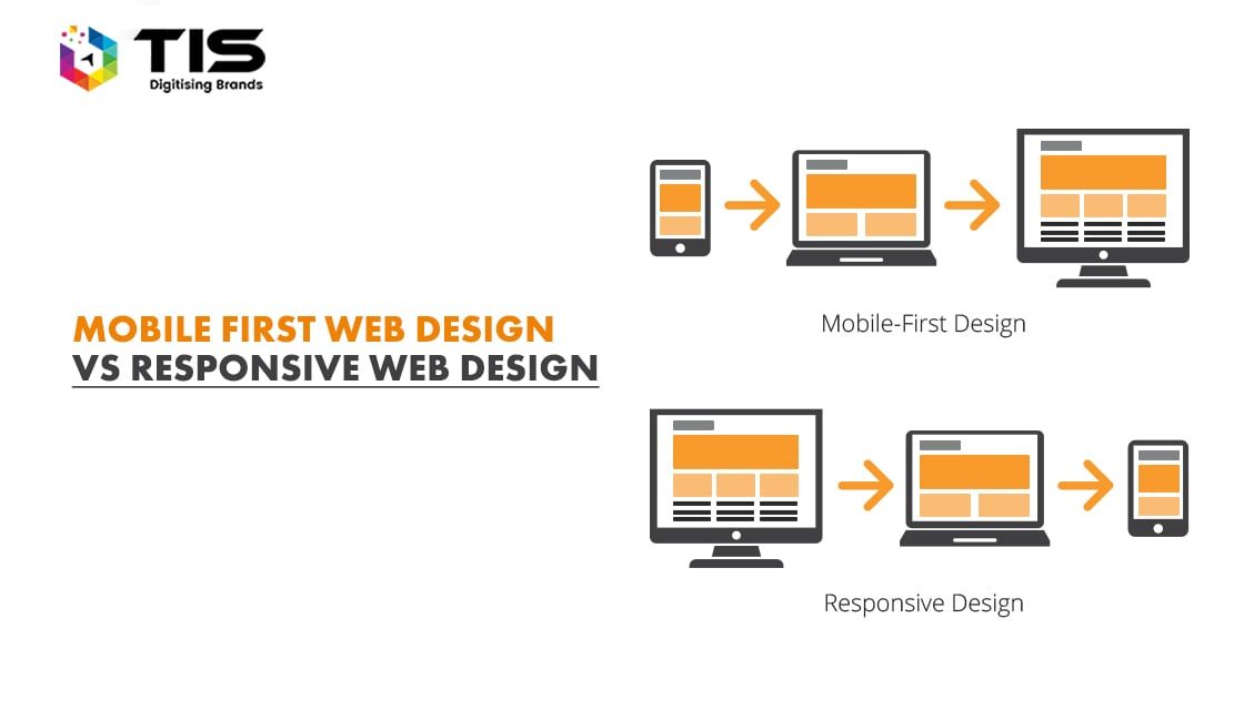
Responsive website design is already making the headlines for months now. It is not a new concept but has evolved as a necessity only now.
Responsive website design is a way that allows your single site to cater to the needs of a range of screen sizes – laptops, smartphones, tablets, and others and adjusts its pixels accordingly with just one content source and one URL.
Speaking technically, it is a single HTML code that adapts itself to the varying needs of varied screen sizes on the basis of CSS media queries.
Responsive website design gained popularity when mighty Google recommended it as one of the factors influencing the website’s ranking in its recent update. And since then, websites with effective mobile experiences are deemed to enjoy better search engine rankings than their counterparts. And this is when it all started!
We have delivered 500+ responsive projects in the last 5 years. Click here to see our portfolio.
Responsive web design is a cumulative effort of three components that work in accordance to create amazing user experiences. These components include:
The flexible text and images adjust themselves as per the layout width set with CSS. This avoids overrunning texts that not only look shabby but also are hard to read. A flexible container ensures that the text is wrapped automatically and that the font size is adjusted on its own as per the requirement of the screen size.
A fluid grid is responsible for adding scalability and flexibility to your web design. This makes sure that there is consistent spacing throughout based on percentages rather than using fixed pixels.
Media queries adjust the page layout as per the viewport size. This might change from phone to phone. For one, content can come stacked in one column, while for the other it can come in two equally spaced columns. The fonts might be smaller in one and larger in another.
So which one should you choose to go for? This is a tough question indeed! Here is a quick break up of RWD in terms of its pros and cons which would aid you in the decision-making process.
Pros
Cons
A mobile-first website is an approach that puts mobile-first. It involves the design for smaller screens first and then the enhancement of mobile design for desktops and other big screens.
This design technique is also known as progressive enhancement. This results in a more focused and clean design. Once the design is ready for mobile, it is easy to transform it into a PC design but is generally difficult the other way round.
This configuration makes use of different HTML for different devices, making use of 2 URLs.
Now that you know the basics of the mobile-first website, let’s know more about the pros and cons of this approach in order to make a well-informed decision.
Pros
Cons
Well, the answer to this question to a large extent depends on your business goals. A business might choose to maintain both a desktop website and a mobile website or may choose to go smart and have a responsive web design that meets the needs of all devices with a single website. This basically is dependent on how big your project is, how much budget do you have allocated and how far you look forward to scaling your business.
If you own a business where you need to update content frequently, a responsive website design would be easier to manage and administer. Further, responsive website design also earned more marks from Google and thus is highly recommended.
7 Reasons Why Internet Marketing Is Important For Your Business
Top Advantages of Using WordPress for Developing Business Website


 731
731 

 (+91) 9811747579