A responsive web design responds to various devices having different screen sizes and resolutions. According to an estimate, there are more than 232 sizes of screens available, which can support website layouts such as graphics, videos, and web content.
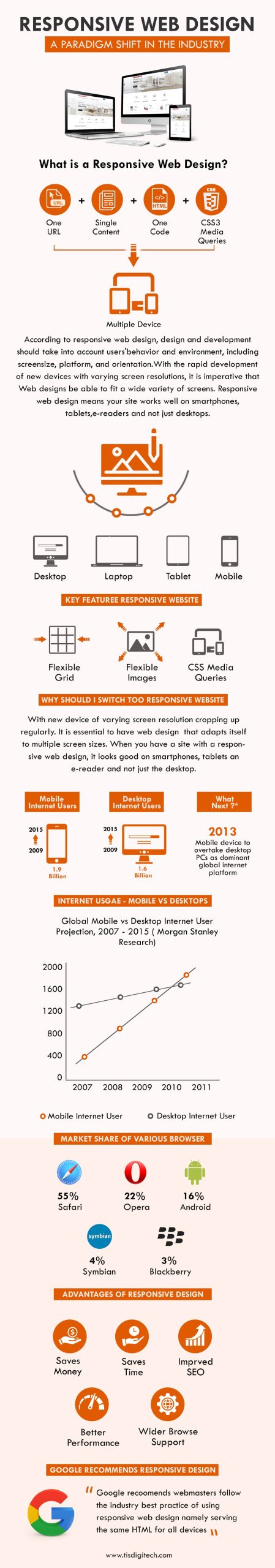
In the cut-throat online world, responsive web design has become the need of the hour. Let us understand the prominent features of responsive web design:
Table of Contents
In recent years, the use of handheld or portable devices has increased rapidly. The devices such as smartphones, tablets, and mini-laptops are frequently used by users to access the internet adding a high amount of traffic to websites. Therefore, there is a need to develop flexible websites, which can fit all types of screens available in the market. And, responsive website designs accomplish the requirements efficiently.
Such website designs have to shrink or spread according to the screens. The use of CSS and PHP technology has helped in facilitating easy navigation for users. To streamline the navigation on the websites a variety of menu buttons, links, and collapsing or expanding texts are used to provide a high-end experience to the users.
A responsive website has a clutter-free design and browser compatibility features. This facilitates loading web pages quickly and easily on various device screens. Moreover, the web designs are rigorously checked at every developing lifecycle to develop bug-free websites.
Moreover, Google is constantly updating its algorithms to provide a better experience to internet users. All the updates released during the past two years have completely focused on the quality of the content, good link building, and web designs.
It is noticed by SEO professionals that the algorithms of the search engines have been programmed according to the users’ needs and requirements.
For example, a user prefers:
Though the list of preferences does not end here, the algorithm has many strings that strongly signify ‘users’ preferences’. In addition with it, the search engine also considers ‘White Hat techniques’ used in web design.
Users prefer websites that have genuine information, a perfect layout, and quickly load on all devices. They are not only spending more time on these sites but also coming back next time. Furthermore, users prefer searching for solutions, products, and services in their nearby locations. Thus, it is always important to target regional or geographical keywords with Meta descriptions in responsive design that helps in improving the ranking of the sites.
These key indicators determine the quality of the websites that increase or decrease the possibilities to gain a better ranking on the top search pages accordingly.
The search engines like fresh, unique, and attractive designs. However, very few know the exact definition of the unique and fresh approach. According to the search engine, an online element (web design, content, or link) must have new and user-oriented information and details. ‘Fresh’ – defines the new updates or latest trends prevailing in the market. Therefore, responsive web design services must have a fresh and unique approach for the users and crawlers.
Thus, search engines, especially Google, always consider responsive website designs, which meet all the above-mentioned requirements and provide a better experience to the users.
Google recommends using responsive web design because this type of design makes it very easy for users to share and link with your content with just a single URL. Also, it also supports the algorithms of Google in allocating indexing properties to the page. It reduces the occurrence of common mistakes that usually affect mobile sites and requires very less engineering time in order to maintain a single page for the same content.
Thus it has numerous advantages due to which most search engines, especially Google, always recommend the use of responsive website design thereby giving the end users a much better experience.
7 Reasons Why Internet Marketing Is Important For Your Business
Top Advantages of Using WordPress for Developing Business Website


 726
726 

 (+91) 9811747579