Technology is progressing ahead at a huge pace, and almost every month various new electronic gadgets get launched in the international market, and one of those gadgets is a smartphone.
In fact, a smartphone is one of the most ‘in-demand’ products, as it provides the user with the flexibility to use high-speed internet on the go and stay in touch with his family and friends via email and other mobile applications such as WhatsApp, and also lets him browse through websites that are useful to him.
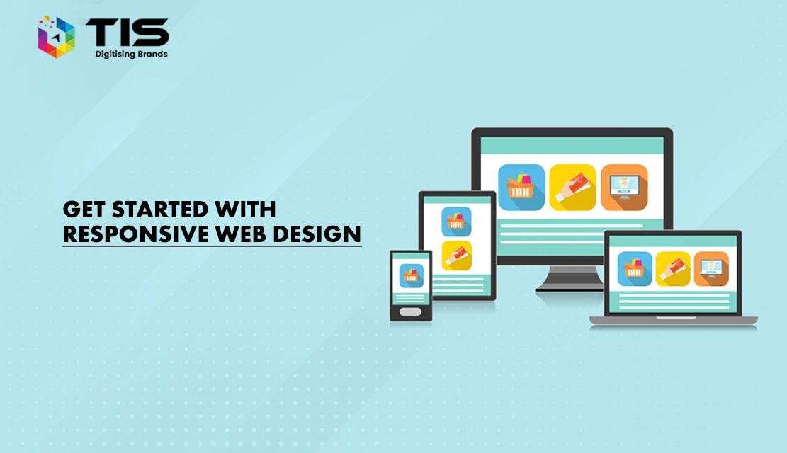
However, for web designers it is one of the difficult tasks to cope with as every other mobile phone, computer and laptop has a different screen size, which makes it difficult for them to design a compatible website. This is where the need for ‘Responsive Web Design’ comes from.
A Responsive Web Design is something that plays a crucial role in the success of a website. A few years back, web designers never used to consider mobile phones, tablets, and different screens while designing a website, as only a few numbers of people used to carry them.
However, the situation is totally opposite now, and hardly there are only a few numbers of people who might not have a mobile phone or tablet to access the internet, therefore, every website design should be responsive in nature, which eventually means that it should be able to get fit into any screen size be it a 3-inch mobile phone screen or a 19-inch desktop screen.
To make a responsive web design, the web designer must have a three-way approach in which he needs to focus on a flexible grid, flexible images, and media queries. So let us begin with the Grid system and Background images.
Table of Contents
Have you ever seen an online magazine? If not, then view it on your laptop or desktop and then try to view it on your smartphone, most probably you will see that the website’s size doesn’t fit on your mobile phone screen. That is because generally, magazine websites are not made using the grid system.
Therefore, to turn the design into a responsive web design, you need to implement the grid system and make the layout flexible, the measurements should not be given in pixels, and instead, you should use percentages.
For example; if you keep the value of width as 50%, it will always be half of the screen the website is being viewed on, regardless of the screen size, and that is where flexible and responsive web design begins.
If you have a plan to use an image in the background, then you need to select the appropriate image, or else you might end up wasting your time because photographs, vectors, or any other images which can’t be tiled are not the appropriate ones to be used with a fluid grid system.
In addition to this, don’t use horizontal gradients either as they don’t scale well horizontally, the texture border also looks terrible. If there is something you can use easily and without any doubt then it is a texture only, which is easy to the tile such as grunge, grain, etc.
While using the responsive approach to make web designs, you need to trim down everything be it the width or height of the web design.
Therefore, always try to use web elements in such a way that if the user has a small browser width he’ll still be able to view everything available on that page, and this could be easily achieved if you use a flexible wrapper made in percent rather than pixels.
In general, media queries refer to the layout of the website and decide how it is going to be on the platform you are designing for.
The main problem of web designers is that they do not consider different types of mobile phone screen sizes while designing and only stick to the desktop and iPad screen sizes, and because of these modules, the user face problems while accessing the website on mobile phones. Therefore, to make all the modules work according to the different screen sizes, the design has to be flexible, and this could be easily achieved or done by using the media queries in the right manner.
By now you must have understood how crucial your web design is in making the website successful by attracting a lot of web users via responsive web design and providing them with what they actually look for.
So, while designing responsive websites, it is important for you to take ample care so that the website fits on screens of all devices—laptops, desktops, mobiles, and tablets. Here are the following top trends for you to consider:
Discard Raster Graphics and instead use Vector Graphics. While Vector graphics use points on a vector map to build the design, Raster graphics use pixels on a bitmap to generate the design.
Vector graphics thus can be resized without losing the quality, unlike Raster graphics which lose quality on resizing. Vector graphics are crucial elements of responsive web design as they maintain clarity on mobiles, laptops, and desktop screens.
As the style of homepages with minimal items is gaining popularity, hidden menus are becoming a new trend. It can be used on homepages for all kinds of gadgets, including mobiles, hidden menus involve a menu icon, which when clicked the navigation options appear.
Websites with a single and long-scrolling page are the best suited for responsive design as these websites fit perfectly on screens of laptops, desktops, and mobiles. Typical single-page websites have a navigation bar at the top, and when the links are clicked, the user is directed to the corresponding location on that page itself (instead of a new page).
The card-based design is an important part of responsive web design technology because of the flexibility of rearranging the website by the screen size of the gadget. In such designs, pieces of information are organized in a grid pattern, involving ‘cards’, with images or texts, in visually appealing fashions.
Minimalism is the hottest responsive web designing technique prevailing today. The technique involves the reduction of clutter and simplification of the entire web page the best you can. The underlying idea is to offer the website to visitors in a simple and visually appealing way to draw interest and attention from visitors.
Conclusion:
In today’s digital era, the use of mobile phones to surf the internet is growing at a much faster pace. But these devices have a limitation in their display sizes and thus they need an approach that addresses the correct way of laying out content on their screen.
Responsive web design is a setup which fulfills the requirements of the users and the devices they are using as it provides layouts which are dynamic in nature and can be changed on the ground of size and capabilities of a particular device.
So what are you waiting for? Get started with responsive design today!
7 Reasons Why Internet Marketing Is Important For Your Business
Top Advantages of Using WordPress for Developing Business Website


 740
740 

 (+91) 9811747579