The world is mobile now. Global Smartphone shipments are breaking all records with Android emerging as the most powerful mobile OS capturing 82% of the total mobile market share alone. In fact, research by various top firms revealed that people are increasingly looking forward to buying everything through their mobile phones and thus mobile purchases have seen a 30% hike in their growth year after year.
As a consequence of this mobile epidemic, it is natural to see more & more businesses jumping the bandwagon to go the mobile way and shifting all focus to developing a unique mobile optimization strategy for their existing web designs to cater to the big percentage of mobile phone users. The reason is – nobody wants to risk sales and leads by showcasing a horrible story of tiny text, unclickable buttons, and a completely messed-up layout before 55% of the global internet audience is mobile. However, website owners still struggle with that one question – How to offer an exclusive user experience on mobile phones?? So, if you really mind losing every 5th visitor to your competitor who already has a mobile strategy for his website, go through this article that talks about the three best mobile optimization methods that are pervasive in the market along with the advantages and disadvantages of each approach. At the bottom, I have also included some case studies which might help you in the long run.
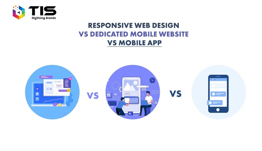
The 3 Best Mobile Optimization Methods
When it comes to optimizing a website for mobile phones, there are only three options to choose from.
- Responsive Web Design
- Dedicated Mobile Website
- Native Mobile App
Since I believe all of you might have already heard about all of these methods before, I would not go in-depth to describe the differences and meanings. I have compiled a good list of the pros and cons of every approach that will help you decide which one is best. In case, you want to know more about Mobile UX Optimization, please go through one of our previous blog – Mobile UX Optimization – Top 4 Tips to learn for better User Experiences that clearly explains the drastic differences in the usability aspects of a desktop, a tablet, and a mobile.
Responsive Website – Pros
- Responsive web design corresponds to a single website for every screen. Hence it becomes absolutely easier, less time-consuming & cost-effective to create, maintain and host just one website for all devices, all browsers, and all screen resolutions. Moreover, the variety of gadgets, mobile-specific browsers, and platforms is increasing day by day and in such a scenario, it is practically impossible to get a separate design for each of them.
- Google recommends Responsive web design as the best solution to serve the mobile audience. This is because, in a responsive website, there is only one URL that allows your users to find you on all devices. Hence it becomes easy for search engine crawlers to index content without encountering any duplicacy issues and errors. Plus, a single URL for your website doesn’t tend to confuse your customers and hence is an optimal solution both from an SEO point of view and a user’s point of view.
- With only one website, you don’t need to work extra on any phase – may it be designing, development or testing. Thus a responsive solution turns out to be the most economical while saving you hours of extra work at the same time. Plus, you need to market or promote only one website so you save expenditure on Digital Marketing as well.
Responsive Website – Cons
- With a single website for all devices, you may have to compromise on the exclusive mobile user experience. However hard you may try, you can’t offer 100% satisfaction to your customers with a responsive design. As per Al Hilwa – IDC’s program director of software development research, it is a misconception to believe that there is a one-size-fits-all platform which has no compromises. This is because there is a drastic difference between the usability aspects and the navigation characteristics (touch-based and keyboard-based gestures) of desktops, tablets & mobiles. Hence a single UI may not end up offering a good user experience despite delivering a good layout.
- A responsive website loads too slowly because of the time it takes to contact the server and respond after detecting the screen size of the device. This happens more frequently with the old & outdated browsers which don’t support responsiveness. In some cases, the site may not even load fully. Since an average person who is browsing the web doesn’t wait much on a site; this can hurt your clicks and conversions to a great extent. According to Kissmetrics, after just 4 seconds of waiting, you are likely to lose 25% of your visitors to your competitors. So, to avoid any such blunders, it is highly advisable to test the responsiveness of your website on various mobile emulators before going live with any responsive design.
Dedicated Mobile Website – Pros
- A dedicated mobile website is one that is specifically designed for mobile devices keeping in mind the technical constraints (touch-based gestures), usability experiences (specific widgets for easy interaction), and limited connection speed of the mobile platform. Generally, the URLs of dedicated mobile websites start with the prefix “m”. For e.g. – m.your-site.com or mobile.your-site.com.
- In a dedicated mobile site, all the focus is on the easy readability of content and hassle-free accessibility of features that are to be offered via a touch screen device. So the user experience that is delivered will amaze your mobile audience with its high-end flexibility and fast loading speed.
- A dedicated mobile site can be beneficial from an SEO point of view if optimized correctly. Usually, for dedicated mobile sites, SEO experts place some code in the htaccess file that performs the user agent (device) detection. This allows the search engines to quickly detect that the device is mobile, and hence they scale their results to rank the mobile-optimized sites higher. So a mobile-optimized site is good for Mobile SEO.
- If you compare a dedicated mobile site with a native mobile app, you will discover that a dedicated mobile site saves your users from the irritation of going through the download and installation phases – the case with every native mobile app.
Dedicated Mobile Website – Cons
- A dedicated mobile website is not cost-effective if compared to a responsive design. Plus, the advantages of a responsive web design generally outweigh the positive points of a mobile site. So if one needs to opt out of the two, it’s wise to go with a responsive design.
- There are a plethora of mobile devices as well and again you have to design your dedicated mobile site in a way that delivers well on all devices i.e. in a little bit responsive kinda way. This is because the layouts & widgets may not be compatible with all small or large-sized mobile devices. Plus, there is distinctiveness in terms of touch screen and keyboard (some mobile phones have a keyboard too) navigation.
- Even if you create a dedicated mobile site, you will have to create another website to cater to your desktop users. However small the percentage of desktop users may be, it is still considerably high that you can’t just ignore them completely. A responsive design can easily cater to both desktop and mobile users but a dedicated mobile site can’t cater to desktop users at all. Plus, apart from creating two websites, you have to manage and promote both of them separately. Hence it will add up to your project budget and the time.
- Multiple URLs can give rise to additional SEO work. Also, since there will be two URLs, you need to redirect all your mobile surfers to the mobile-optimized site which may take some time and the users may get irritated with this.
Native App – Pros
- Excellent UX – A Native app offers a better user experience as compared to both the above mobile optimization methods.
- A Mobile App can operate both online and offline i.e. with an internet connection or without an internet connection respectively. It means that your customers will be able to access your information anytime anywhere. Both the above solutions – responsive web design and a mobile site can’t be accessed offline and this is another plus point of having a mobile app.
- Native Mobile Apps have the tendency to load extremely fast on all mobile devices. Plus, you can create a unique mobile marketing strategy via the inclusion of advertisements in your mobile app.
- Your app is visible as an icon to your customer right on his/her mobile front end. Hence, if offered with a unique design & extra features, more & more people (friends’ community) can be encouraged to download & install it giving your brand a unique reputation and giving your massive mobile users a new way to engage with your products and services.
- Since an app is software, it can deploy some mobile-specific features into the handsets of your customers which none of the above optimization solutions can do. For e.g. click to call buttons, GPS data or NFC tags, accessing the camera, contact lists, photo galleries, etc.
Native App – Cons
- No organic search techniques or SEO can work for your mobile app. An exclusive mobile marketing strategy needs to be carved out to market a Mobile App which is both costly & time-consuming.
- Just owning a native app and not developing a responsive web design or dedicated mobile site will not do. A mobile app is not at all a complete replacement for a website. There is a considerable number of desktop users also which you can’t completely ignore. So in either case, a mobile app has to be designed to complement your website and co-exist with it.
- You will need a separate mobile app for every mobile OS. Mobile apps are architectured in a way that they operate only on the specific OS for which they are made. For e.g. – there is a different app needed to cater to iPhone, another app for Blackberry, and one more for android. So altogether, owning a native app is the most expensive solution amongst all the above optimization methods. Plus, to launch it in various App stores (Google Play, Blackberry App store, and Apple’s App Store), you need to invest an extra amount of money as well as time for their approval.
- A mobile app offers zero flexibility as compared to other optimization methods as you need to come up with a new updated version every six months or even less. Plus, for all the updates you need to take approval from the app store again. So it’s really difficult and costly to manage a mobile app.
Now the question arises – Which one amongst all the three is the best approach to cater to the ever-growing mobile customers??
Well, the answer to this question lies within you. Don’t just take any decision in hurry and don’t just take anybody’s word for it. Find out the purpose of your business and do some market analysis on your targeted niche. Choosing the best solution wholly depends on your own business needs and specific requirements. Here I am discussing the most common cases with you.
Case 1 –If you are looking to establish your online presence in minimal possible time along with the least expenditure –
RWD would be the best option for you. Not only a responsive website will support standard mobile devices but it would certainly answer most of your customer’s basic queries, location info, contact no, email address, and so on. Later on, when you grow big and establish a good online presence, you can think of getting a native mobile app in addition to a responsive design.
Case 2- If you have a small or a middle-level business –
A dedicated mobile app is not recommended. Dedicated mobile apps can’t be indexed by search engines so there is no probability of yours reaching out to the maximum no. of people via any organic search medium or results. Plus, since there are already thousands of apps flooding the app market, users may not find your app worth installing for just accessing the products and services unless it offers some extra usability that they think is important to them. Most often, getting a mobile app is advisable for well-known businesses to which people already pay attention. However, if you provide services like education on phone via tutorial mobile apps or you have the idea of an exclusive chat app, or if you own a restaurant business or a jobs board; spending on a dedicated mobile app may pour in dollars. This is because they make the day to day life easier for customers and thus if you have an exclusive strategy, you never know what fascinates your customers.
Case 3- If you have an eCommerce business –
For eCommerce businesses, it is highly recommended to have both – a well-designed responsive website + a dedicated mobile app. This is because; shopping is one aspect that every person loves to do. And what else is more entertaining & time-saving than browsing thousands of products via touch, zoom and swipe both offline and online? If you own an exclusive online store that sells products that are unique, having a mobile app is a mandate if you don’t want to risk your sales and leads from the bulk mobile traffic.
The Final Note
From my personal experience, I would advise all the readers to keep in mind the 3 key mantras while choosing the best mobile optimization method –
- Analyze your business goals and your purpose.
- Stay on your budget and don’t just invest because others are doing.
- Explore the targeted niche and the browsing habits of your customers.
Mobile dedicated, adaptive or responsive, all of them are possible methods to implement mobile user experiences. Each of them has its own advantages and disadvantages. Although their execution is different, all of them follow the same principles when it comes to using them. In fact, normal users cannot even make out and difference among them as they all appear to be the same for end users.
I hope I have said much useful for you to decide on your own. However, if you are still scratching your head and determining the best web design strategy that’s right to go the mobile way, contact us for an affordable quote. In case, you want a complete makeover of your existing website for mobile phones, hire a virtual team of our experienced designers and developers to make your dream a reality.


 761
761 

 (+91) 9811747579