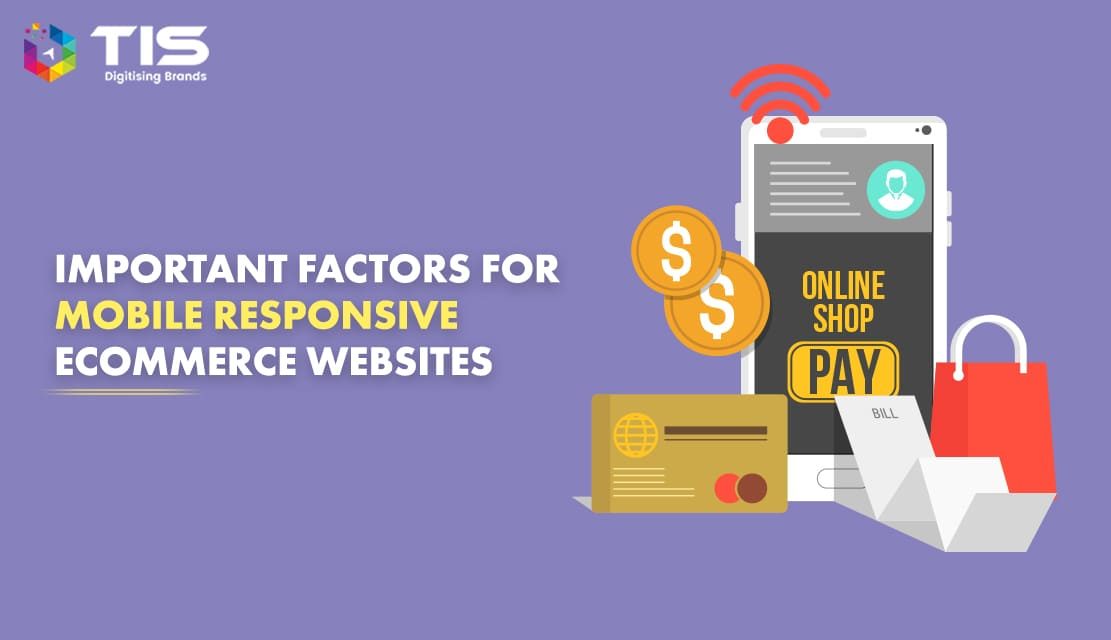
Just like anything in internet marketing, not all mobile responsive e-commerce sites are created equal – there are those that stand out and those that fade in the background. If you are thinking of taking the first step to developing an e-commerce website for mobile, here are the seven key components of highly effective e-commerce sites specifically crafted for the on-the-go consumer.
Table of Contents
The first thing you need to keep in mind when developing e-commerce sites or any sites for that matter for mobile devices is the ease of use. Consumers behave differently when they are using their smartphones or tablets versus if they are using their desktops or laptops.
Chances are when they are shopping using their smartphones or tablets, they are doing something else – whether they are watching TV, waiting for the train, stuck in traffic, etc.
That being said, mobile responsive e-commerce development should be centered on being user-friendly and one way of doing this is by putting your site’s search box in a prominent location on the page so shoppers can punch in a query with no difficulty. Also, the search box should be incorporated across all pages to enhance accessibility as well.
According to the research firm Nielsen, approximately 50% of social media users access their social networks through their mobile gadgets.
When you develop an e-commerce website for mobile, do not forget to enable and empower your customers to spread good words on their social networks.
Be creative. Maybe at the end of the checkout process, there could be a window that would ask your satisfied customers to share their delightful shopping experience with their Facebook friends and Twitter followers.
According to an infographic published by Mashable, 40% of mobile shoppers will abandon an e-commerce site that does not load in three seconds.
Undeniably, the mobile retail business is all about speed and if you want to gain profits, ensure that your site is optimized for mobile surfing. Simplicity is the key. Take out unnecessary elements that will slow your page down. Keep visual elements necessary.
Further, speed does not only apply to load time but to the check-out process as well. Make it as convenient and as easy as possible for consumers to complete their shopping.
Takedown lengthy forms and allow users to save their information the first time they visit your site so they don’t have to go through the process repeatedly.
During the mobile shopping frenzy last Black Friday, most purchases were carried out using the iPad, followed by the iPhone, and followed by Android devices.
The point here is mobile shoppers are using different screens with different screen sizes and your site should be able to adjust seamlessly to these varying screen sizes.
Mobile responsive e-commerce website development should follow the principles of responsive website design to deliver the best mobile shopping experience to your consumers whatever screen size they are using to view your site.
This point may sound mundane, but this one small nuance can spell the difference between a successful and unsuccessful mobile responsive eCommerce site.
Many online retailers forget the fact that mobile shoppers don’t have the benefit of using a mouse and are instead using their fingers as their “navigation hardware.”
There’s nothing more annoying when a consumer can’t click on a link because the site’s layout is too crowded. Make sure to space out links accordingly to allow users to click using their fingers without difficulty. You can also employ other tools such as drop-down menus to ease up navigation.
You can either develop mobile apps that will enhance your customer service engagement or incorporate certain elements on your e-commerce site to allow your customers to reach your customer service team in a breeze.
You can use a clickable phone number, eliminating the need for your customers to dial your customer service hotline. This can also be a clickable email or SMS number.
If it will not affect your load speed, you can also use live chat for instantaneous interaction. You can also develop mobile apps that will help your customers track their orders.
Do this and your customers will feel well taken care of and there’s a higher chance that they will purchase from you again.
Lastly, you are probably the most important ingredient when coming up with an effective mobile responsive e-commerce website. Why? Most of the time, business owners are reluctant when it comes to incorporating new technologies into their operations.
Mobile responsive e-commerce website development cannot commence if you don’t have the mindset that the retail landscape is vastly and quickly changing because of technological advancements and if you want to cope with these shifts, you need to embrace technology.
Simplify the design of your mobile responsive eCommerce website. Ecommerce websites with simple designs have the best conversion rate. Ensure that the visitors’ eyes are drawn straight to the Call-to-Action (CTA) space or the products you sell. So, avoid putting too many clutters on the homepage as that will render it difficult for visitors to locate the CTA at very first sight.
As your objective is to sell your products, you should take ample care not to distract the visitors with too much clutter.
Simplify the menus. Do not confuse the visitors by having complicated menus. If menus on your mobile responsive eCommerce website are with too many categories, it will confuse the visitors and that will prevent them from locating what they look for. To do away with the confusion, you can use broad terms to categorize your products.
For example, if your mobile responsive eCommerce website sells keyboards, mouse, and cabinets; then instead of having separate category menus for each of the items, you can group them into a single category—Computer Accessories.
You need to engage your customers on your website as much as possible. As your customers are not likely to make purchases every day, you need to make them visit your website often. By writing regular blog posts, you can make your customers visit your website now and then. They are likely to purchase more if they visit your website more.
Unlike traditional shopping, your online customers won’t have the benefit of actually seeing and inspecting your product or services. This virtual environment can actually work to your disadvantage because not physically seeing the merchandise before a purchase can create doubt among shoppers.
That being said, when you develop a mobile responsive eCommerce website, your first order of business is to create a design strategy that will build your credibility and authority in your niche. Without trust, there is no sale. Craft your online store in such a way that highlights your strengths and positions you as the best in your industry.
Unlike your other web properties such as your corporate site or your business blog wherein you can exercise creativity, when it comes to building e-stores, ease of use definitely precedes visual appeal. Navigational tools should be properly located on the site. A navigation list should be displayed on a sidebar or on top of the page coupled with the use of breadcrumbs. Clearly designated buttons should be visible. There should be a search bar that can be easily seen. Plus, an accessible “contact us” at the bottom of the page.
Of course, this does not mean that your site cannot be visually appealing, especially if your success depends on catching your customers’ attention through powerful imageries as in the case of fashion brands. What we’re saying is that you can’t be too fancy and artistic that it compromises the functionality and substance of your site.
A great meal does not end with an appetizer. Following the same line of reasoning, when you develop a mobile responsive eCommerce website, it’s not enough to have a great homepage. As your hook to draw customers in, it is just right that you carefully craft your homepage, but don’t forget your product pages. These pages are the ones that will “seal the deal” and close the sale.
Pepper your product pages with great photos that show your products from different angles. Provide as much information as you can to help your customers decide. Informative, interactive, and experiential – are the three elements that your product pages should possess.
We have given three tips on how you can make a successful eCommerce site, but one question still remains: What is the best eCommerce application platform? Some developers would push for their favorite platforms, but the best answer to this question is it depends on the nature of your business and the size of your operations. Choosing an eCommerce application platform will vary depending on what you are selling, how many products you are selling, your reach and how broad your market is, and a number of other factors. If you’re new to this, it is best that you hire an eCommerce development company to help you figure things out so as not to waste your time and investment.
The first thing to keep in mind while creating an eCommerce website is that it must not only be good-looking but also provide a stress-free shopping experience to its customers. In order to engage your current customers as well as expand your business by acquiring new ones, you need to develop an online store that is easy to navigate along with offering a flawless checkout process on any device.
It is important to remember that you need not develop everything from scratch and keep testing your website. Instead, you must take good care of your customers’ feedback and observe your competitors make sure that you are following the current trends for your website.
7 Reasons Why Internet Marketing Is Important For Your Business
Top Advantages of Using WordPress for Developing Business Website


 672
672 

 (+91) 9811747579