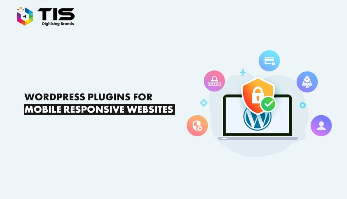
In today’s mobile web world, missing a mobile-friendly website is not acceptable as it will impact the overall performance of your business pessimistically among your competitors since the usage of Smartphones and tablets has tremendously increased in the past decade and has changed the scenario of SEO completely from desktop-focused to mobile-focused services. But the main question is what if your website is also counted among the millions of websites running on WordPress? In that case, you will need plugins to make your website mobile-friendly and easily accessible for Smartphones and tablet users. With tons of plugins available for WordPress, there is nothing that can beat the charm of WordPress websites, but your ability to choose the best plugins is the only way of making your website more manageable and interactive.
Lack of responsiveness in your website might frustrate your targeted mobile customers and you will be surprised to know that around 48% of mobile users whine about the websites being not optimized to be used on mobile screens.
Certainly being a professional business owner, you never want your customers to become frustrated and if you have a WordPress website, then you are lucky to have the option of installing plugins for making your website responsive and interactive.
For your convenience, I have sorted out the top 6 WordPress plugins that you can install on your WordPress site to make it responsive.
Table of Contents
Smush is a popular WP plugin for compressing and optimizing images. Featuring multiple engaging images to enhance user experience and increase conversion rate, this plugin is informative and attractive. However, images are, unfortunately, space hogs and slow down your website.
As you upload your images, they are automatically compressed to a size that will not affect page speed but is still mobile-friendly.
Once you install Smush and choose the images that need resizing, it will compress up to 50 images at a time, no matter how long your website has been up.
Smush’s features include:
Additionally, you can upgrade to Smush Pro, which offers additional features.
If you host your website through a company such as HostGator or GoDaddy or use WordPress.com, Autoptimize is among the best plugins for improving upload speeds.
If you wish to make your WordPress website mobile-friendly, then Autoptimize is for you. It supports optimizing and lazy loading images, optimizing Google Fonts, syncing non-aggregated JavaScript, and supporting WebP and AVIF formats. Also, it optimizes your database, removes cache, and aggregates scripts to improve your website’s loading speed.
Additionally, the plugin enables you to minify the JavaScript and CSS files to improve the performance of your website. This tool optimizes HTML, CSS, JavaScript, fonts, and images and supports WordPress core emojis. Using the Autoptimize plugin, you can optimize your website and reduce loading times. We believe this plugin is one of the best minification plugins, but it must be appropriately configured.
Completely integrated with 24 modules, this plugin allows you to efficiently alter your WordPress site to make it adjustable to different screen sizes. Most of these modules are very impressive making it easier for the developers to make the website mobile friendly and interactive. Once this plugin is used, it makes your website very clean with an uncluttered interface making it easily accessible for mobile phone users.
Advantages of Using JetPack as a WP Mobile Friendly Plugin are:
With this WordPress plugin, you can easily create a mobile-friendly website. You can use it to display styles of push navigation, sliding navigation, static navigation, and fullscreen navigation on desktop and mobile websites. In addition, it is helpful for designing and developing one-page websites.
Superfly provides a wide selection of features, including an easily accessible menu selection, a rich menu, a primary menu, various colours, and different section choices. There are also several notable features such as a static menu, icon menu, a new bonus add-on, full-screen menu, display control, a live editor, an icon bar, Google fonts, rich elements, export/import, enhanced styles, submenu navigation, a panel design, and excellent performance.
When it comes to enhancing your WordPress website’s user experience, Superfly is an ideal solution for you. As C223 powers it, its animations are unique compared to other plugins.
You can take your existing menu and turn it into a touchscreen-friendly menu within minutes with Max Mega Menu.
The plugin enables you to add a WordPress widget to your menu, customize your menu with a theme editor, and modify its behaviour based on built-in settings. The various features of this plugin include multiple menu locations, drop-down mobile menus, the WordPress menu system, sub-menus, a grid layout builder, WordPress widgets, PHP and Javascript APIs for developers, styling menus, a simplified CSS editor, sticky menus, 600+ Google fonts, a theme editor, mega menu submenu styles, slideshow submenu transitions, menu item options, and more.
Max Mega Menu was developed with an emphasis on code quality, performance, and usability. Furthermore, it is compatible with the Elementor page builder and integrated WooCommerce.
The bottom line is that Max Mega Menu is an excellent plugin for creating good-looking, professional mega menus.
Would you like Accelerated Mobile Pages? Then AMP is the plugin for you.
AMP for WP is a Google project that optimizes WordPress website pages, so they load faster and are more visible on mobile devices. It is a free plugin that offers a lot of great features. Using this plugin, you can improve page load times without writing any code. This plugin can make contact forms with WPForms, Contact Form 7, Gravity Forms, and others. In addition, the site offers native commenting, star ratings, content teasers, and more. All AMP for WP plugins are compatible with the browsers and improve the look and functionality of any website. Different themes will be available for choosing as well as an in-dashboard theme customizer that allows you to customize how your AMP content should look.
This is accomplished by making your site’s pages mobile-friendly, allowing them to be viewed on various tablets and smartphones.
Your Google rankings will be enhanced as well as your visitors’ browsing experience as you install AMP for WP.
With Hummingbird, you can make your website faster and mobile-friendly. The plugin is a versatile and optimized caching plugin that instructs your visitors’ browsers to save copies of your website files. Using Hummingbird, you can compress GZIP for faster file delivery, minify and defer CSS and JavaScript code, and eliminate render-blocking resources. You can also enable lazy loading for images.
Additionally, it offers asset optimization, performance reports, advanced caching, Cloudflare integration, compatibility with Smush image optimization, advanced minification, and many more features. The user interface is straightforward to use. Furthermore, Hummingbird provides monitoring capabilities not found in any other plugin. Therefore, it can be used by beginners and professionals alike. Additionally, it offers an inline/defer option that you can activate whenever necessary.
Hummingbird is an excellent plugin for new website owners since it provides suggestions, ideas, and tips for making your site mobile-friendly and optimized. Once the changes are made, it also tracks the progress.
‘Asset CleanUp’ is a mobile-friendly WordPress plugin for improving your website’s speed by reducing HTTP requests, which is crucial for quicker page loads.
Each page is scanned, and all assets that have been loaded are detected, thus resolving this issue.
You can reduce the bloat on a page/post by removing the CSS/JS codes that are not necessary to load
As a developer, you can scan the source code and remove plugin or theme conflicts. You can test your URL on various websites to determine its performance, such as GT Metrix, PageSpeed Insights, and Pingdom Website Speed Test. The good thing about Asset CleanUp is that it won’t conflict with other performance plugins.
The speed of your site will be significantly improved with this plugin!
The ease of navigating a whole website can be challenging on some mobile phones.
The phone’s sidebar and menus might be hard to see, and users may struggle to find the next steps.
WP Mobile Menu is the perfect WordPress plugin that efficiently adds a three-layer mobile menu to any WordPress site. The software can be installed, activated, and customized without coding knowledge.
Features include:
You can choose from three premium versions for your professional, business, or enterprise needs with WP Mobile Menu.
WordPress sites can easily be made mobile-friendly using Touchy because it works everywhere. The program has a header, menubar, customizable header colours, logo images, and header background images. Some notable features include widget locations, top-notch performance, extensive navigation options, and WooCommerce cart icon functionality. That’s not all! Additional features include accessible calls, email buttons, multilevel drop-down menus, shortcodes, colour customization, translation-ready customizer settings, individual options, 1500+ icons, and multilevel navigation.
This plugin was designed to work on smartphones. It is also compatible with multiple sites and works with all desktop browsers.
If you are looking to make your existing WordPress website into a mobile-friendly site with an interactive user interface, you can use any of these 10 above-mentioned plugins as all of them are designed specifically with an amazing bundle of features to make the conversion from the desktop version to mobile version very efficient and easy.
However, we have an experienced and qualified team of WordPress developers that will make your switching from desktop to mobile versions much more convenient. However, if you have already made up your mind to make your website mobile-friendly using any of these plugins, do let us know which of these plugins you will choose. Or do you have any other plugin or third-party application in your mind for making these changes? Do share your views in the comments section given below.
7 Reasons Why Internet Marketing Is Important For Your Business
Top Advantages of Using WordPress for Developing Business Website


 686
686 

 (+91) 9811747579